Welcome back to the Coyote Monitor blog. We didn’t spend this summer taking it easy — we spent it making the tool better, and today we get to show you the result. Meet the new version of our process status dashboard — available for SQL Server on-premises, Azure SQL Database, Azure SQL Managed Instance, Fabric SQL Database, and Amazon RDS for SQL Server — which now runs alongside the classic one under the name Process Status v2.
If you’ve been a DBA for more than a few years, you know this scene: someone pings you because “the app is slow,” you open SSMS, run a couple of queries against sys.dm_exec_requests and sys.dm_os_waiting_tasks, and if you’re lucky, you catch something. Show up five minutes late and the blocking has already resolved itself, leaving you with no idea what caused it. That’s exactly the “showing up late” problem Process Status v2 tackles from a different angle.
Why we redesigned the process dashboard
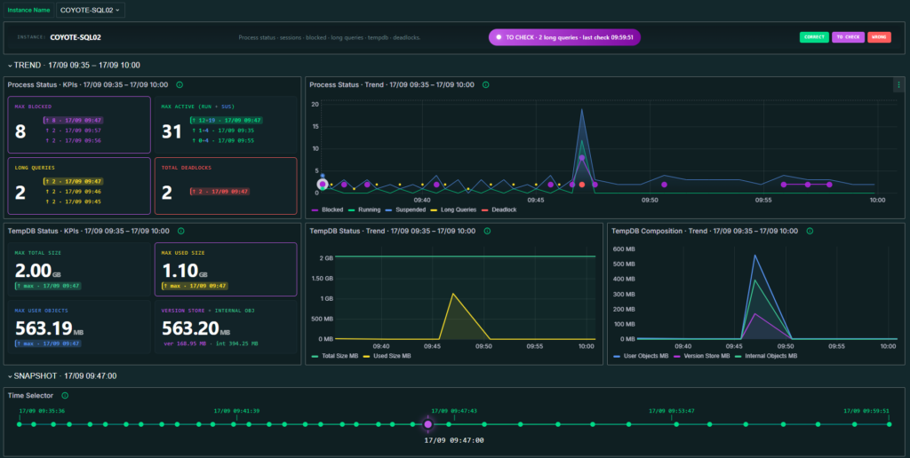
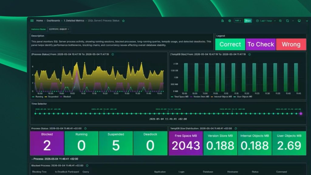
The classic Process Status dashboard, part of our SQL Server monitoring and Azure SQL monitoring sections, already did a lot: process trends, a TempDB breakdown, a long queries table, and tables for blocked processes, deadlocks, and TempDB usage on a given date.
What changes in v2 isn’t what it monitors, but how you navigate, filter, and dig into that data: tables with no search or filters, blocked processes and deadlocks lumped into one flat table, and no single status indicator. Here’s the short version:
| Process Status (classic) | Process Status v2 | |
|---|---|---|
| Instance-wide status | No single indicator; per-panel colors only | One status badge: HEALTHY / TO CHECK / NO DATA / CRITICAL |
| Blocked processes and deadlocks | One flat table, deadlock shown as a flag | Two separate tabs, each rendered as a tree |
| Deadlocks grouped by cycle | No, individual rows | Yes, one header per detected cycle |
| Search and filter sessions | Not available in the tables | Free-text search, status filters, configurable sort |
| Jump from a peak to the detail | Manual, via the Time Selector | Peaks are clickable and open the matching tab |
| Execution plan for a session | Not available | Modal with Query and Execution Plan tabs, plus XML copy |
| TempDB (trend and per-date breakdown) | Yes, in its own panels | Yes, integrated into the same process view |
Blocking, deadlocks, long queries, and TempDB: a quick refresher
Before we go further, a quick refresher on the four concepts the dashboard is built around. They work the same way whether you’re on SQL Server on-premises, Azure SQL, Fabric SQL Database, or Amazon RDS, since they all share the same database engine.
Blocking happens when one session needs a resource — a row, a page, a table — that another session already holds, and has to wait for it to be released. That’s normal behavior for any transactional engine; the problem starts when the wait drags on.
A deadlock is different: two or more sessions block each other in a cycle, so none of them can ever move forward. SQL Server detects this on its own and picks a “victim” session to break the cycle, as explained in Microsoft’s official deadlocks guide.
A long query is a session that’s been active for a disproportionate amount of time compared to the server’s normal behavior, without necessarily being blocked.
And TempDB is the system database shared across the whole instance, where SQL Server stores temporary tables, intermediate results from sorts and hash joins, and row versions for row versioning — with the details well documented on the official TempDB page. It’s a shared resource: if one session abuses it, the whole instance feels it.
What actually changes day to day
One status badge instead of a dozen colors
The header now shows an instance-wide status — HEALTHY, TO CHECK, NO DATA, or CRITICAL — calculated from recent blocking, long queries, and deadlocks. In the classic dashboard you had to read several per-panel colors to reach the same conclusion.

Finally, search and filters on the tables
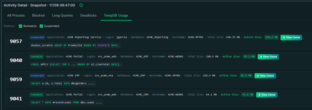
The flat-list tabs (All Process, Long Queries, TempDB Usage) now come with free-text search — matching against SPID, application, login, database, hostname, status, and query text —, status filters, and sort buttons. This is the improvement we’ve heard about the most, and the classic dashboard simply didn’t have it.
Clickable peaks on the trend
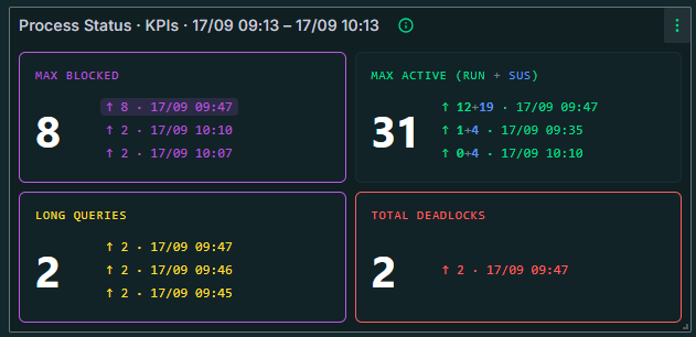
The aggregated KPIs for the selected range — peak blocked processes, peak active sessions, peak concurrent long queries, and total deadlocks — are now clickable: click the busiest moment and you jump straight to the detail tab for that exact instant, no need to drag the Time Selector by hand.
Blocking and deadlocks, each with its own tree
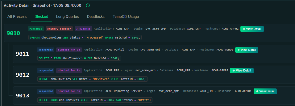
In the classic dashboard, blocked processes and deadlocks shared one table, with deadlock just flagged on the row. In v2 they’re two separate tabs: Blocked, with the blocking chain shown as a tree — the root blocker on top, blocked sessions cascading below —, and Deadlocks, where every detected cycle gets grouped under its own header. Reconstructing who was blocking whom by hand is no longer necessary.
TempDB Composition, now built in
The breakdown between version store, internal objects, and user objects already existed in the classic dashboard as its own panels. In v2 it’s folded into the same view as processes and blocking, so you don’t have to jump between sections.
The big one: execution plans per session
This is, to me, the change that matters most. Every row in the detail view opens in a modal with the full, formatted query text and, when one was captured, the graphical execution plan, with a button to copy the XML. The classic dashboard only showed the query as plain text inside the table; there was no way to see the plan without jumping out to SSMS. Every row also gets context badges (primary blocker, N blocked, blocked for Xs, plan, deadlock) that tell you at a glance what role that session is playing.
Why this matters for a DBA’s day-to-day
In practice, what changes is how long it takes to go from “something’s wrong” to “here’s what’s causing it.” The classic dashboard already had the history, but filtering, separating blocking from deadlocks, and getting to an execution plan meant manual steps outside the dashboard itself. With Process Status v2, that path gets a lot shorter. It’s no coincidence that SanLucar Fruit — with IT Manager David Carrasco Campos — reported a 70% cut in incident resolution time after they started monitoring with Coyote Monitor; navigation improvements like these help make that kind of number possible.
Availability: dashboard in beta
As of this writing (September 15, 2026), Process Status v2 is in beta and runs alongside the classic Process Status dashboard, which remains available unchanged. The plan is for v2 to eventually replace the classic dashboard, but there’s no retirement date set yet — they’ll coexist while we collect your feedback. If you spot anything odd while trying it out, let us know: that’s exactly what this phase is for.
Try Process Status v2 today
If you’re already a Coyote Monitor customer, the dashboard is available from your monitored instances. If you’re not yet, you can try it with our 30-day free trial, no credit card required, or request a demo if you’d rather have us walk you through it first.